 Share
ShareFrom a young age, we learn that red often means ‘stop’ or ‘danger’, and that green usually means ‘go’ and ‘safety’. But we also pick up a lot of emotions from other colours, whether we realise it or not.
The psychology of colour is important for us Marketers because colours can evoke emotion, influence how your customers think and feel, and make your brand stand out from the competition. Choosing colours for your company’s branding is a fundamental part of how you want your customers to perceive you.
In this blog, we look at how the use of colours can help brands appeal to their customers, drive engagement, and boost sales.
How brands can utilise colours
The use of colour on your website is about much more than just having an attractive and eye-catching site, although that certainly is a bonus! When thinking about what colours to use, considering how you want to appear to your customers is a good place to start.
Check out how these colours have been utilised by brands:
Red
If you want to be attention grabbing, then red could be the colour for your brand, especially if you’re in the food industry. Have you ever noticed that a lot of fast-food restaurants use red in their branding? This isn’t a coincidence.
Psychologically, the colour red can evoke hunger – a fact that Coca Cola, McDonalds and Kellogg’s all use to their advantage. Red is generally seen as a passionate and dynamic colour, but be warned, it can also be interpreted as angry or dangerous.
Yellow
Yellow is another attention-grabbing colour, but it seems to divide people – as it seems that one either loves it or hates it; so, it’s not the best choice to appeal to the masses. It can provide a feeling of movement or speed (which is why UPS, Hertz and Ferrari use it), as well as a feeling of warmth and happiness.
Practically though, yellow can be difficult to use on the web, as certain shades can strain people’s eyes and it can cause accessibility problems.
Blue
Do you want to appear trustworthy? If so, then blues should feature in your colour palette, as it promotes feelings of peace, serenity, and intelligence. Blue is famously used by Visa, PayPal, Facebook and American Express; all companies that have access to a large amount of your personal and financial data and therefore want you to trust them.
It’s also used a lot by healthcare companies, and it’s the most common colour for social media logos. Blue is a favourite colour choice amongst men and women, making it is safe option, which is why it’s widely used. With that in mind, incorporating blue into your branding may not help you stand out in the market.
Orange
Perhaps your company has a non-corporate atmosphere, if so, then orange should feature on your site because it’s usually associated with positivity and fun – just look at Nickelodeon and Fanta for example. The downside of orange is that it can also conjure up feelings of being ‘cheap’ – for example, EasyJet, which may or may not work for your company.
Green
Does your company sell organic products, health apparatus or industrial farming equipment? If so, the chances are that green already features in your branding. Green is synonymous with nature, growth, and health – it’s a relaxing colour that we associate with the outdoors.
Green is used by John Deere, Land Rover, Starbucks, and Spotify; all companies that we associate with the countryside or relaxing with a coffee and listening to music. People generally seem to like the colour green, and it can help to reduce anxiety and increase productivity!
Black
Or perhaps you want your customers to view you as sophisticated and modern? In which case, black ought to be your choice. Black is often considered to be a luxurious and powerful colour, think Chanel, Apple, and Moet, for example.
If you’re in the high-end fashion market, black could work well for you, but if you’re something akin to a healthcare provider, then it’s best to avoid black as it will likely be interpreted as oppressive and cold.
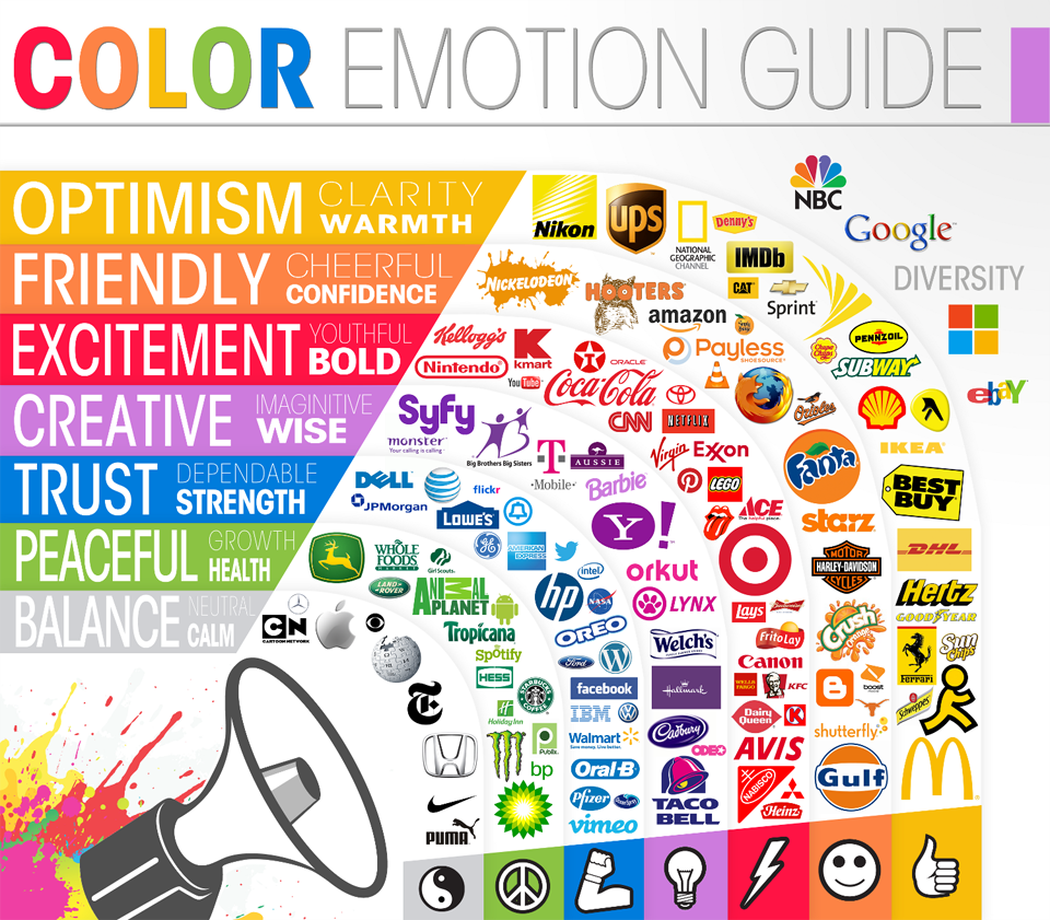 Image Credit: Huffington Post
90 seconds is all it takes
People tend to make a subconscious decision about a product within 90 seconds of viewing it and, according to Small Business Trends, 93% of buyers said they focused on the visual appearance when buying a product. Keep this in mind, because the colours of your website need to attract and appeal to customers, as well as reflecting your brand and its personality.
Once you’ve identified the 2 main colours or the 2 main emotions you want users to associate with your company and its branding, you can start to add in secondary and tertiary colours that compliment your branding.
Is it time for a refresh?
In my 7 years’ experience as a project manager, I’ve discovered that many companies still don’t create digital-specific brand guidelines, and they often don’t think to refresh their branding as the company evolves and grows. If you’re looking to update your website, here are a few quick tips from me:
- Take the opportunity to select colours that make you stand out from your competitors.
- Your favourite colour may be lime green, but it may not be appropriate for your company; don’t chose colours based on your personal preferences.
- If you’re a global brand, you’ll need to be aware of cultural differences and that certain countries have different meanings for different colours. For example, the UK views yellow as a happy and positive colour, but in Egypt it’s the colour of mourning, and in Malaysia it’s a colour reserved for royalty.
- Maybe you don’t need to change everything on your website, a few tweaks could make all the difference. For example, changing the colour of your CTA buttons could drive an increase in leads. When HubSpot changed their CTA buttons to red, it outperformed their green version by 21%. (Side note: don’t assume that a green CTA is all it takes to make your customers engage.)
Discover what our designers can do
Choosing the right colours for your brand can be tricky, and creating a whole new brand or refreshing an existing one can be a daunting task.
If you feel that your branding or website no longer reflects your company or what your company stands for, then it could be time to talk to our team of experienced designers. They have an in-depth understanding of taking traditional brand guidelines and interpreting them in a new way for your website or even creating brand new guidelines for you