 Share
ShareAs the web has matured, images have become an intrinsic part of the experience. Whether it’s a beautiful photo from a client’s case study or a throwaway GIF shared on social media, we use and encounter more and more images all the time.
In many areas internet speeds continue to increase, and with this added power comes the temptation to constantly maximise the possibilities when serving content online. In age when many people can stream high resolution video and audio on a whim, surely there’s no harm in a few nice, big photos?
We web developers must be constantly mindful of the consequences of our work. Many of us may well be fortunate enough to have access to rapid broadband speeds, but for lots of our users this will not be the case. A careless approach to performance could mean the difference between a great experience and potentially, if a heavy web page stutters to a halt, no experience at all.
There are many ways this can be addressed, and one of those is how we handle images.
Image Formats
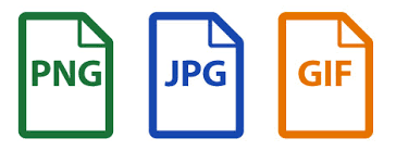
First of all we can think about the most suitable image format to employ. For photos we can use raster types such as JPG, PNG and GIF. In short, this means an image of fixed dimensions made up of coloured pixels. Each of these has strengths and weaknesses – PNG, for example, allows for transparent pixels – and we can tailor our choice to each use case.
In terms of file size and, consequently, page speed, we can make some real savings by using vector formats such as SVG. Commonly used for graphics such as logos and icons, vector images comprise a series of 2D points connected by lines and curves. This means that file size is greatly reduced and, as an added bonus, also allows us to scale the image infinitely with no loss of fidelity.
Compression
Photos make up a large proportion of the images we use and in many cases the most appropriate format is JPG. When preparing images for use on a website, we can make use of image compression software in order to further reduce the file size and shorten the time it takes our page to load.
Whilst there are some very useful batch compression tools, it’s worth taking the time to adjust images by eye and optimise the compression. This way we can achieve the ideal balance, retaining visual quality and maximising reduction in file size.
Developer Tools
Once an image is ready to be served online, it’s time to dig into the good stuff and write some markup. Web developers now have a variety of HTML tools in order to further improve the experience for users and ensure that an image being downloaded is no larger than necessary.
‘srcset’
The first of these is an image attribute called srcset. This allows us to define a range of dimensions for a single image, each of which could be displayed depending on the device in use.

For example, a large feature image might be displayed at upwards of 1500 pixels wide on a desktop monitor, but this is much too large for the same web page on a smart phone. Using srcset we can define and upload a smaller version, and indeed a range of sizes in between, too. What’s more, we can use srcset to include versions of an image specially tailored to high pixel density screens, which are increasingly prevalent.
‘sizes’
sizes gives us a natural complement to srcset. With an array of images available, sizes allows us to explicitly define some of the – you guessed it – sizes at which an image will be displayed. Each image width is declared alongside a media condition – in other words the size of the device for which it should show.
Used in tandem, srcset and sizes allows a web browser to calculate the smallest appropriate image to retrieve depending on a user’s device or browser size.
‘picture’ and ‘source’
Finally, let’s talk about picture and source. These elements are not quite so focused on performance, having more to do with what we might term the “art direction” of a website. However, some of the previous approaches to this issue involved loading multiple images and then only displaying one: definitely not the most performant way of handling things.
picture allows us to define an element which represents a single image on a webpage. Within that, source tags can be used to define totally different source files to switch between. In other words, we can change not just the size of the image but replace it with a totally new one. This is very handy when we want to show a square image on a small device like a phone, but replace it with a much shallower “widescreen” image on bigger displays.
As with sizes, we use a media condition to control when this happens. The result is that we can display different images on different devices whilst only loading the one we want.
In WordPress
Here at Coast we use WordPress for a lot of our clients, and this allows them control over the content on their website, including the images. That process of content management needs to be simple, so where does all of the above factor in?
Fortunately, WordPress comes with a very handy function called wp_get_attachment_image() straight out of the box. We can think of this a little like a helpful robot working on our behalf; we tell it an image and, in return, it brings us back a fully-formed HTML image tag which makes use of srcset and sizes.

This function can be used anywhere we need the ability to manage images. Our clients can worry about selecting great content, and leave the heavy lifting to the website.