 Share
ShareOn 24th July 2018, Google Ads UI changed for good and – despite being given a year to get used to the update – the need to “revert back to original AdWords” was very appealing!
As an agency, we ran Friday Knowledge Shares around the updates to ensure that we as a team knew what was changing and what new features were available.
So, one month in, how is everyone feeling about the new Ads interface and features?
Well, our PPC specialist Rich says:
“The new Promotion Extensions are great for offers that include a discount code, much better than trying to use sitelinks or ad copy to convey the message and responsive search ads look really cool taking a lot of the manual work away from us marketers in terms of A/B testing ad copy – giving us more opportunities to improve the accounts.”
Marketing Executive Lauren thinks:
“The new interface is more user friendly. The ability to drag and drop columns and search using the “Go To” bar saves times and means she can analyse data much easier.”
So far so good!
As for me, I wanted to share my favourite parts of the new interface and explain why they make life a little easier.
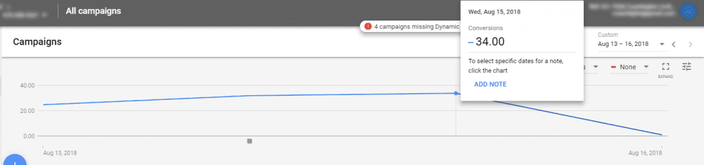
Add notes
Something Analytics has enabled us to do for a long time has now been brought over to Ads and we are welcoming the new feature with open arms.
Within Coast, some accounts have more than one specialist in the account at a time. For example, if the Display team are running a GDN campaign, they may add new campaigns within the interface while the PPC specialists optimise your account. The new notes feature enables us to stay in control and know exactly what is going on and when. It gives us the opportunity to instantly react to results and it’s a great time-saving tool!
‘Go to’ search option
Many of us at Coast have found the most difficult thing about using the new UI is the fact it looks so different to the older version. Campaign information has moved from the top to the side and reporting information has now moved into a handy “Tools” section.
This has meant the ‘Go to’ search bar has been a life saver when trying to discover where everything is.
Overview page
The ‘Overview’ page is a great way to quickly identify issues and positive results. The bold colours and easy to use drop down menus makes the page really easy to use.
The ‘Biggest Changes’ section is great when spotting significant changes and it saves time with reporting as we have a top-level overview at our fingertips, meaning we can gather insights quickly – giving us more time to optimise and produce even better results.
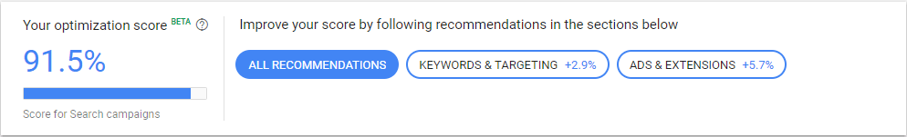
Recommendations page
Previously known as the ‘opportunities tab’, the Recommendations page now gives us an “Optimisation Score”, which is an estimate of how well your account will perform. Below this we are given lots of new opportunities/recommendations.
Each recommendation you complete increases your optimisation score, while improving performance. I like the competitive edge to this feature, who doesn’t want to reach 100%?!
Bidding strategies
The new “Smart” optimisation settings are something we know we will be seeing a lot more of in the future. For those who don’t know, they are automated bidding strategies that enable Google to react accordingly based on what users are most likely to do.
For example, if the system knows someone is more likely to convert, they will bid higher within the keyword auction. If your account has enough data, bid strategies such as ‘Target CPA’, ‘Maximise Conversions’ and ‘Maximise Clicks’ are a great way of improving results using Google intelligence.
So far here at Coast, we are happy with the new changes and features, though we are still getting used to the layout and there are still parts that could be improved but, overall, the new system gives us more time to create new strategies and improve our client’s performance. What are your thoughts?