 Share
ShareI’ve said the word Gutenberg so many times recently, and it’s for good reason. For those of you that don’t know what Gutenberg is, it’s the new text editor coming to WordPress which is scheduled to land in version 5.0 – the next major iteration of the CMS that will introduce a new way of editing content on your website.
I’ve been over the pros and cons in a previous post; I even did a ‘Friday Knowledge Share’ session with a lucky group of fellow Coasties a couple of weeks ago. As you can tell, I’m hot on this topic!
What we have currently is TinyMCE. Some people may opt to calling it ‘the bleak screen of sadness’ and in fairness to those people, they’re not wrong. It’s a fairly basic editing experience that most of us are accustomed to using.
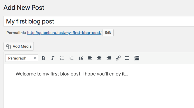
You have a reasonably sized box to type into, and controls at the top which follow you along. This is great for the novice blogger, but with Gutenberg, you’ll see something a little bit different:
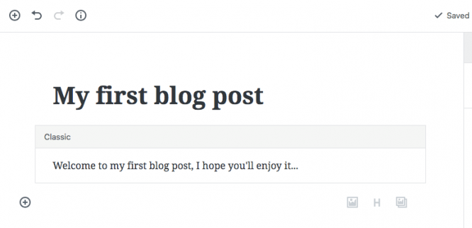
That’s a very different experience, right? The first thing you’ll notice is that the title and content area have been merged together. These two elements are still technically separate, but visually, the title is now part of the content space to make the writing flow much easier for people.
The second biggest difference is that everything is now split into blocks. You’ll see that with TinyMCE, everything was in one box, effectively one block. This made it hard to rearrange content and insert additional media because you had to play around with paragraphs and indentations – something people struggled with while using TinyMCE.
Adding a Block
An important distinction between Gutenberg and TinyMCE is blocks. A block is basically a small section of content that is independent from the other bits of content in your post.
An easy way to understand this, is that each paragraph of text in the TinyMCE (classic) editing mode is its own separate block in Gutenberg. An image would be its own separate block, a list, a quote or even a heading would now be a block so everything is broken down to be more granular.
By default, you get lots of different blocks to choose from, and plugin authors can create new blocks for even more customisation. Click the small plus icon to the left of the current blocks in your post and you can select a new one from the menu.
The main benefit that Gutenberg is marketed on is that with these new blocks, things can be dragged ‘n’ dropped around your post easily.

Let’s not forget though that most blocks are used to form some parts of the toolbar within the TinyMCE editor. So whilst things have moved around a lot, you will still have access to those familiar tools and options.
Things like heading types, images or lists which were a button in the TinyMCE toolbar have migrated into their own block. However, smaller customisations like bold text is obviously only accessible to blocks that have the option of including text in them.
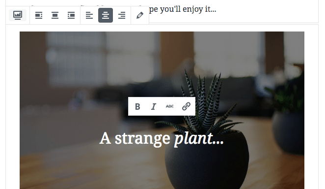
There’s also some new types of content we can play with. Not only can you add images, you can now add cover images and galleries too, something that you weren’t able to do with TinyMCE by default. Let’s see how these blocks work.
Extending Your Images
By selecting the cover image block, I can then choose to upload a new image, or add an existing image that is already in the media library of the website. Once you’ve added the image, you then have the opportunity to include a piece of text on top of it (with the addition of some formatting – such as making the text italic).
Publishing a Story
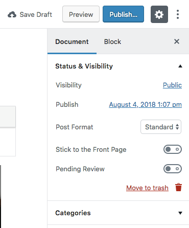
Now that the post is ready, albeit very basic, it’s time to preview my changes before it’s published for everyone to see. To do that you will need to look over to the right hand side of the screen which is where the meta boxes are.
Without diving in too deep, meta boxes were those small boxes which floated around the screen. You could hide them, move them around the editing screen to where you liked and they would usually house some additional options if added by a plugin for example.
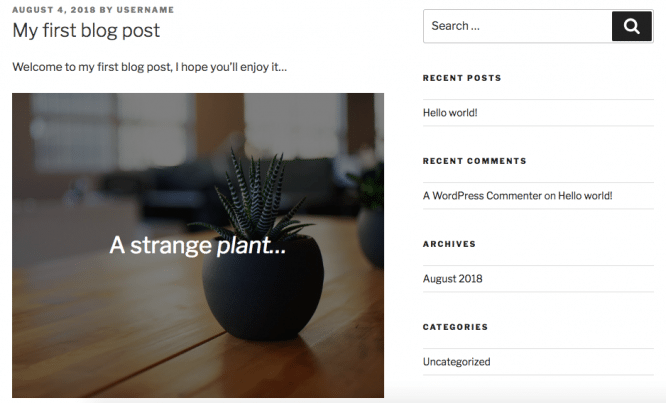
Now let’s click the preview button and see what we get on the front-end of the website.
There we have it, our first Gutenberg post in our theme. It doesn’t look like much just yet, but it is definitely a step in the right direction. Let’s check out what options we have and then we can publish or schedule the post for later.
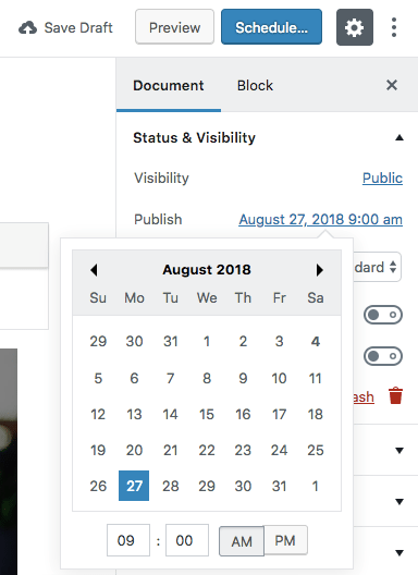
Much like in the old editor, you will see all of the extra options down the right hand side of the page. This is where you can extend your post customisations by adding tags, scheduling the post for a later date and even adding a featured image to the post.
This section remains mostly unchanged, so the options you can expect to see here won’t look much different.
A Future with Gutenberg
It’s not clear exactly how well received Gutenberg will be and how much it will truly improve the editing experience within WordPress. One thing that is certain though is that it’s very different: there are more options and it’s more flexible to create rich content for your website visitors.
Here at Coast, we’re biding our time and want to see what kind of effects Gutenberg has on the variety of sites that we work on. This new experience won’t be suitable for all of them and there’s lots of work to be done to ensure plugins and themes are compatible with the new changes – that’s something that isn’t a quick fix and will take time to plan and get right.
We’d love to hear what you think of Gutenberg! Are you excited to see the new features ‘in the box’ or do you prefer the ‘classic’ TinyMCE experience?