 Share
ShareLast week saw Apple kick off the week-long WWDC (World Wide Developer Conference) 2018 in California. Love them or hate them, Apple announced some interesting changes to the ecosystem that I’m sure had some people (myself included) scratching their heads.
If you would have asked me a couple of years ago when the Apple Watch first came out if I was going to get one, I’d have laughed and said no. If you would have asked me a few months ago if I would like to browse the web on my new Apple Watch, again I would have laughed and said no.
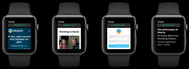
As you can imagine, this year Apple announced that they would be bringing WebKit to the Apple Watch. WebKit is the system that powers web browsers such as Apple’s Safari browser and was once used in Google Chrome too. Think of WebKit like the engine of a car. It’s incredibly powerful and is open source which of course means it’s used and built upon in various online projects.
Whilst the version of WebKit brought over to the Apple Watch won’t be the full version you’d expect to have in Safari, it’ll still be highly performant and allow you to browse websites on your wrist just like you would on your laptop of desktop computer.
What Does This Mean for Developers?
Surprisingly, Apple has opted to implement the watch based browser in a way that mimics a phone’s attributes so in actual fact, most websites will famously ‘just work’ when watchOS 5 (the new version containing this feature) is released later on in the year. The watch will use the same browser resizing techniques that are used on phones, also known as Media Query breakpoints.
The watch itself has a screen size of roughly 150 pixels, but this is then scaled to 320 pixels so that the contents on the screen will appear crisp and high resolution. So what this really means for developers is; you can take a break. As long as the websites you create are responsive and conform to modern web standards, you won’t need to change any code at all to ensure it’s working on watches correctly.
Should You Design for Smart Watches?
No. As the Apple Watch performs certain functions to scale up to a small smart phone screen (and many other smart watch makers will too), there shouldn’t be any need to design with a watch in mind. Whilst you still need to be very much aware of how a design will scale on small screens overall, you shouldn’t need to worry about edge cases.
Web browsers can do the rest of the work for you which is great news to many developers who work tirelessly to make sure websites work on as many hardware and software variations as possible. Does anyone have an iPhone 5C that is running iOS version 7.1 in landscape with the toolbars active? That’s quite a specific setup and not every visitor is the same.
The Future of Responsive Websites
Personally, I’m very excited to see a feature like this coming soon; but I’m also a little wary of the fact that with everything going digital and almost anything potentially having a built in web browser (I’m looking at smart fridges here), it could cause a lot of headaches.
It is refreshing to know that the web is becoming more accessible in lots of different ways without having to do magic tricks to get things working well. What do you think about wrist based web browsing? Is this something that you think would be used a lot? It will be interesting to see how this may start a trend of more versatile web browsing going forward.