
A snap election calls for another snap poll of the UK’s main political party websites, a review we last carried out in March 2010. This time we’ll include social media, which is where the lion’s share of the action is bound to take place.
I want to see which party’s web presence gets my vote. Which parties are most likely to make the best use of the web to energise voters. Which party will do a better job of spreading its platitudes, clichés and fake news? A sceptic? Moi?
I’m going to be slightly curmudgeon and as non-partisan as possible. This won’t be a political blog post – it’s a blog post about political websites. It’s not about policy; it’s about the more important things: font size, alignment and spacing!
As usual, we’ll work in alphabetical order.
The Conservatives

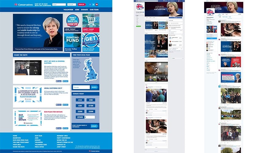
Interestingly, some of the pages (for example, conservatives.com/yourmanifesto) take you to a page with a link straight out to Facebook, which is probably quite a practical approach, although this will exclude my mother and other non-Facebook users. As a side note, the page address is “yourmanifesto”. If it really was mymanifesto, it would contain some different pledges. It’s their manifesto so why don’t they just call it that?
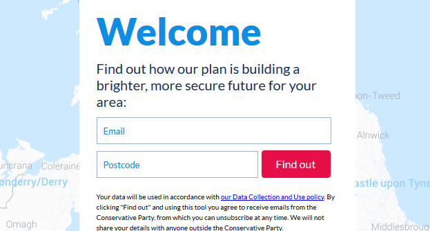
If you want to find out what the Tories are doing in your area (conservatives.com/yourarea), you’ll have to provide your email address, which is asking a bit much in my opinion. Like many web users, I generally want something for nothing, and giving out my email address for what’s likely to be claims and promises along the lines of ‘Creating more jobs’ and ‘Delivering the best schools’ (these are no-brainers – who wouldn’t want those things?) makes me think that I’d probably be getting nothing for something.

Generally, the pages are easy to read, with clear fonts and good contrast.
Look and feel: ![]()
Ease of use: ![]()
Facebook: 545,000 followers
Twitter: 246,000 followers
www.conservatives.com

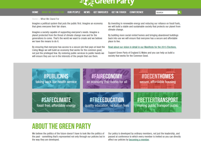
The Green Party
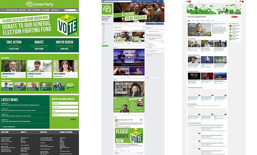
There is the usual problem of pages sometimes opening up in new tabs or microsites opening in the same window as the main site, creating a double-whammy of confusion. But I’m not following a specific user journey, I’m just clicking around the site; arguably it wouldn’t be such a problem for a site visitor with a specific task on the site.
The content on the inner pages is all quite close together – more white space is required. In places it looks like the style sheet is broken. There’s barely any room to breathe between the breadcrumb and the first lines of copy, and then we immediately knock up against the grey box and then the big heading, which looks like it should really be at the top of the page…


Ease of use:
Facebook: 167,000 followers
Twitter: 193,000 followers
www.greenparty.org.uk
The Labour Party
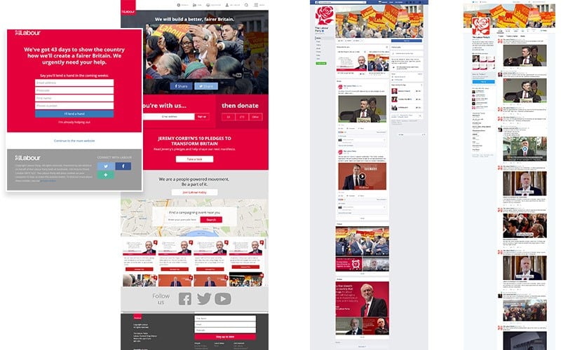
OK, scratch the bit about the splash screen – two days on from writing that it seems to have been replaced, at least on mobile.
Once on the home page everything looks supersize – everything has mobile proportions but exploded width-wise to fill which ever screen it’s being viewed on. The page looks as you’d expect on a mobile, which is presumably where the majority of their traffic comes from. But these days there are other ways of creating responsive websites so they don’t look like giant mobile pages when viewed on a desktop or laptop screen.
The bank of tweets below the map on the home page still doesn’t appear correctly in Firefox. That’s been broken for a while.
Again, a link from the main menu (My Labour) takes you to a microsite. You can do that but you need to give us a hint that we’re about to leave the main site, with an icon like this: ![]()

The inner pages of the site have a simple single column layout and the font is large and easy to read.
Look and feel: ![]()
Ease of use: ![]()
Facebook: 616,000 followers
Twitter: 392,000 followers
www.labour.org.uk
The Liberal Democrats
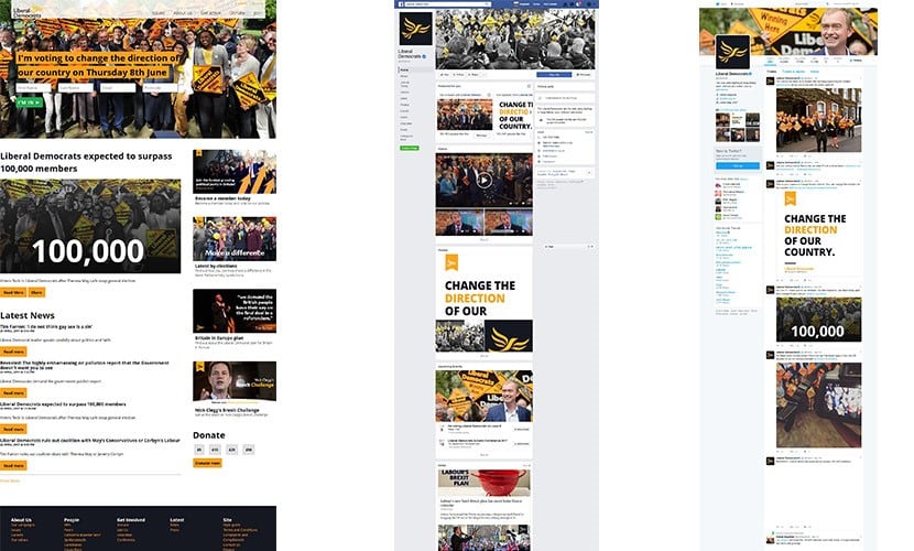
From the Issues pages there is a lack of an obvious onward journey at the end of each article – there isn’t even an old fashioned ‘< Back to Issues’ link. That’s an issue. Easy, you say. You could use the browser’s Back button, you could even move down to the footer and find the Issues link there, but those actions require extra effort and momentarily break your journey. All this stuff is important.
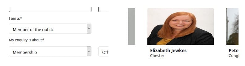
The quality of the code is generally good, but their contact form needs a bit of work to get the full height of the drop-down field text to show. This is broken in both Firefox and Chrome, but it’s OK in Microsoft Edge. And you’ve got to feel for Chester’s candidate, Elizabeth Jewkes, who we have to hope has been accidentally squashed to fit in that picture box.

Look and feel: ![]()
Ease of use: ![]()
Facebook: 155,000 followers
Twitter: 178,000 followers
www.libdems.org.uk
UKIP
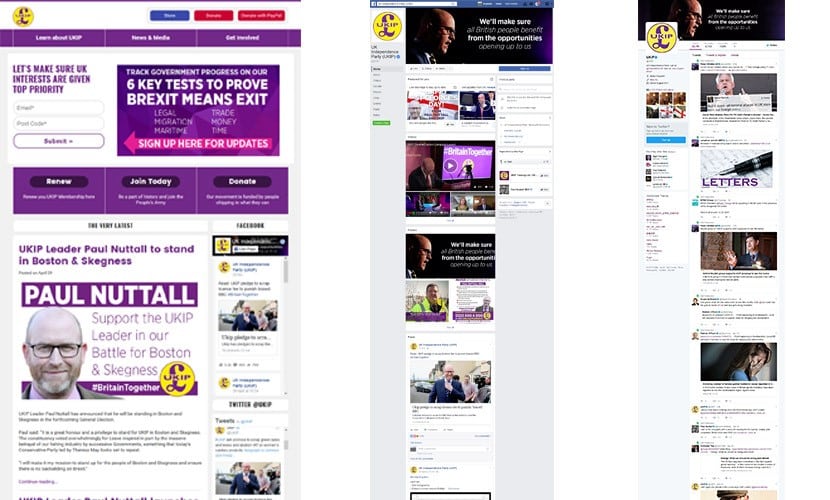
The site follows the traditional two-column blog layout but it has good, clean design and clear typography.
Each post opens up on its one page but once you reach the end of the piece, like the LibDem site, there is no real onward journey – no links to previous or next stories or related posts, which is a bit of a missed opportunity for continued user engagement.
But that logo…
Look and feel: ![]()
Ease of use: ![]()
Facebook: 540,000 followers
Twitter: 160,000 followers
www.ukip.org
The Official Monster Raving Loony Party
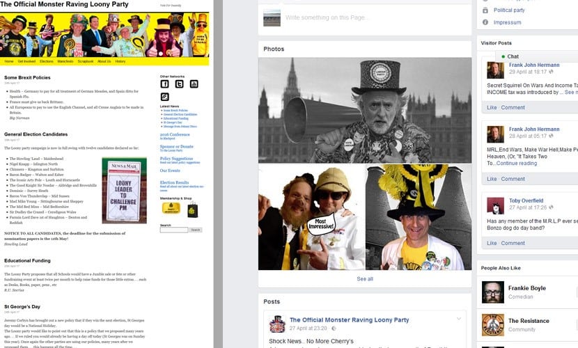
The simple, old fashioned blog layout is like meeting up with an old friend after a few years apart. The straight forward navigation, clear text and crazy policies were just what I was expecting to find. And you’ve gotta love those great parody images on their Facebook page.
As they had the idea of making St George’s Day a bank holiday before Jeremy Corbyn, they conclude:
Vote loony for yesterday’s policies … tomorrow.
LOL!
Look and feel: ![]()
Ease of use: ![]()
Facebook: 3869 followers
Twitter: 3673 followers
www.omrlp.com
And the Winner?
Based purely on their websites, my swing-o-meter is pointing in the direction of the Green Party as the winner. What do you think? Let us know.
You have until 22nd May to register vote and voting takes place on Thursday, 8th June. Here’s Jon Snow (not that Jon Snow, the Channel 4 News one) with a voting how-to: How to register to vote – and why it matters.

There is a full list of the UK’s political parties on Wikipedia.