 Share
ShareAccording to Alexa.com’s rankings of top sites in the UK, bbc.co.uk is the 7th most used site, while the most recent SimilarWeb rankings of U.K media publishers has the BBC receiving the most pageviews.
To sum up, if you didn’t already know, the BBC website is a big deal.
Right now, the BBC website isn’t just publishing the news – for those of us in the digital design sector, it is the news!
What’s going on?
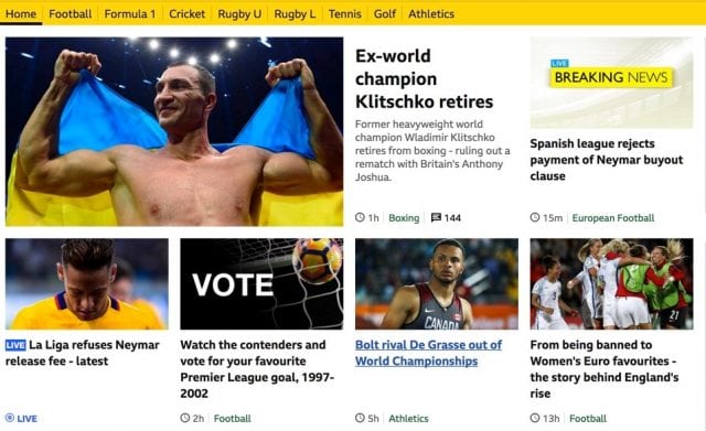
The BBC have started to roll out a new brand identity, starting with the BBC Sport section of the website. This new branding will then be rolled out across the entire BBC portfolio, encompassing TV, print and of course the web.
The BBC’s Chief Design Officer Colin Burns posted a blog about the rebrand which covers off the roll out and some of the decisions they made.
The benefits of creating a font
There’s a number of reasons why the BBC would want to create their own font as part of this rebrand.
Colin Burns mentions several in his blog. Firstly, it saves the BBC money as it removes the need to pay for the license for existing fonts – BBC budget reductions have been fairly big news over the last few years, so it makes sense that they’d be looking to save some money in this way.
It also allows the BBC to move away from some fonts that were developed in a more print focused era – many of these styles of font aren’t so user friendly in the era of mobile first.
Finally, and perhaps most importantly, it further adds to the feeling of a unique brand identity for the BBC. While many people won’t be consciously aware of what font a website is in, having a brand-unique font designed specifically with digital in mind will help the BBC website to have that snap recognition quality – that moment when users already recognise the brand without seeing the logo.
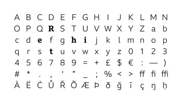
BBC Reith
Thoughts on the BBC rebrand
The new branding on the BBC website looks great and further builds on the existing strength of the BBC’s digital portfolio.
This new brand identity more clearly differentiates the BBC from other online entities, with BBC Reith helping to give the website more personality and making it feel more modern and up to date.
The fact that the BBC is looking to continuously improve their brand identity is a good thing, particularly when you consider that some of their biggest competitors – Channel 4 and Sky – have both undergone major brand overhauls.
Even when you have a website as popular as the BBC’s, you can’t rest on your laurels. When your competitors are working to strengthen their brand, you need to make sure you’re putting the work in to stay at the forefront of users’ minds.
The BBC are doing just that with their latest rebrand, once again showing why they are such a dominant presence among UK digital media outlets.
What do you think of the BBC’s rebrand? Do you have any thoughts on the choice to create BBC Reith, rather than use an existing font? Let us know in the comments below.